Tropy is very promising software for organizing photos of archival documents, magazines and newspapers. So I want to thank all creators of it.
But it has some usability drawbacks (IMHO, of course) which can be corrected to ease of its usage.
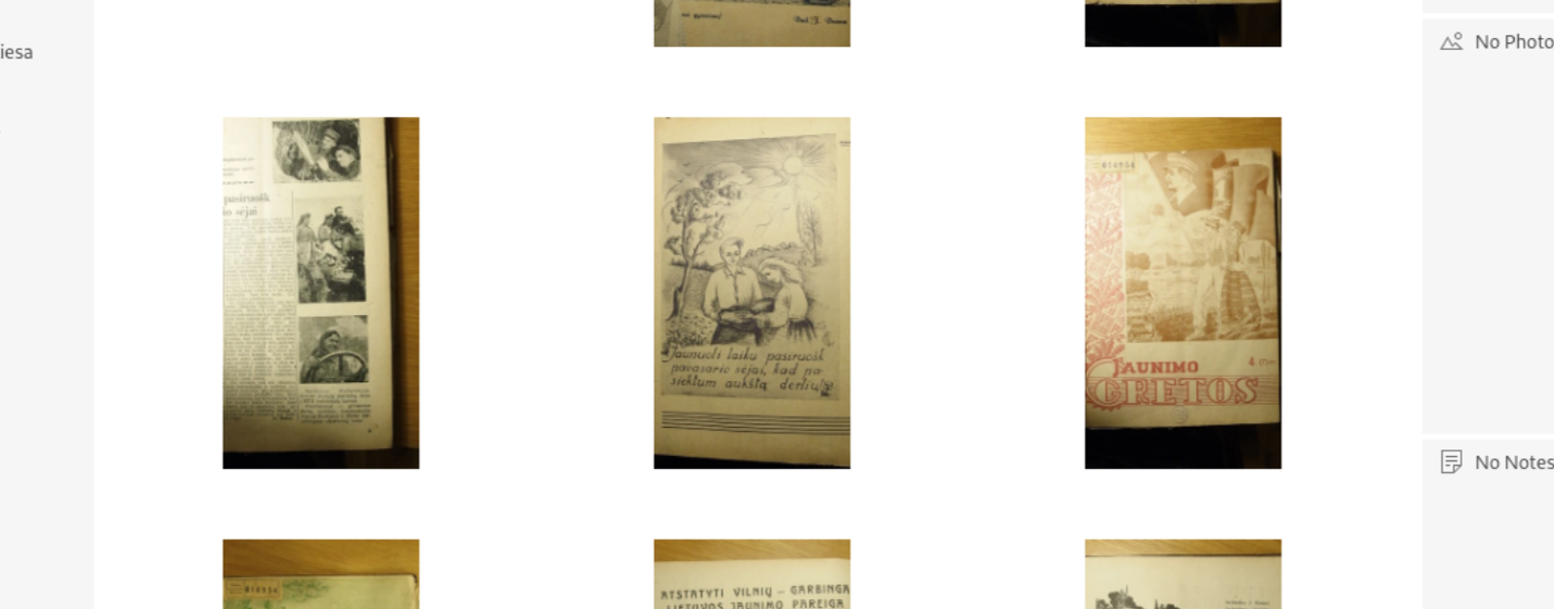
I see huge margins around photos in project view (grid), white space constantly occupies more than photos. I can’t distinguish one document from another even in maximized grid view (my documents usually are very similar). That isn’t very comfortable. I understand that it is only thumbnails, but maybe they can be bigger? Maybe user can decide what maximal size of thumbnail should be (maybe while importing photos). Now it is working well only with magazines photos because different covers. Latvian magazines are presented with much less white space around thumbnails and that looks more pleasant and useful: http://www.periodika.lv/periodika2-viewer/view/index-dev.html?lang=en#panel:pi|issue:/p_001_dadi1968n17|issueType:P
Users have different monitors so there is different user cases but white space add no value for any of users, I think.
Documentation mentions preview, but pressing space do nothing for me. I’m working in Linux, maybe that is the problem? Tropy version 1.8.
Working only (or mostly) with keyboard greatly speed up workflow. Tropy lacks some very important keyboard shortcuts as: add tag (and even when tag pane is focused, hitting Enter doesn’t activate “add tag”), focus to metadata and tag panes in both views, lists and tags list in project view, jump to notes text field or jump to the notes pane in item view. Maybe they exist, but I didn’t find them.
And I didn’t find a way to change size of gird view only by ctrl+mousewheel or only keyboard.
It would be very helpful to see all existing shortcuts in one dedicated page of documentation (now it lists only general shortcuts).
Can user select several tags or lists at once in project view? I don’t see such possibility now, but it could be very helpful to narrow sorting.
And user can’t go from one tag to another with keyboard (like user can in lists), only with mouse.
Focus isn’t retained with merged item after merging items but remains unchanged, so user must scroll up to see next document to merged.
That’s not criticism but wish to make Tropy better.
Thanks! Suggestions like this are extremely helpful and we’ll do our best to address them as we work/plan on individual parts of Tropy.
With regard to the grid size, one issue is that we don’t want the thumbnails to consume to much space. @flachware may correct me, but I think the thumbnail size is the only reason for the current limit. We could make the thumbnail size configurable or, now that the thumbnails retain the original aspect ratio, we could also consider loading the original photos if the current zoom level exceeds the thumbnail size. At this point there would not be too many photos visible per page (even for very large screens), so it might not be too big of performance and memory hit. It’s certainly something we could explore.
The preview is currently a macOS only feature (using the native quick look window). We’ve been planning to create a custom preview window which we can use on all platforms.
We put a lot of effort into supporting keyboard navigation, so it’s always good to hear if there’s something to improve. For adding tags via the keyboard we assumed the ‘Add Tag to’ field would be used. For instance, if you select one, or multiple items’, then tab over to the tag panel you can press down/up to activate the field and start typing. I suspect you tried to press Enter there to activate the field? We should certainly look into having Enter activate the field too. I think we used up/down mostly because you can use left/right to switch between the tabs.
Changing the grid size via keyboard is missing, that’s definitely something we should address (and ctrl+mousewheel is a good idea as well). I’ll add a ticket to track this.
You can view (and change) most of the keybindings in the file resources/app.asar.unpacked/res/keymaps/project.en.yml (or you could add overrides for your locale by adding a file there).
You can select multiple tags by holding the Ctrl key while selecting tags. Selecting multiple tags currently always narrows down the results. But major changes to the tag selector are planned at some point (better keyboard navigation, better handling of large numbers of tags, etc.) – just a question of time until we get to it.
I’m not sure I can reproduce this? When I merge a number of items the resulting item is selected and has focus at the end of it. How do you merge the items exactly to lose the focus?
We switched from square thumbnails to thumbnails that reflect the original aspect ratio a while ago, this change causes larger white space around the icons. Thus I wanted to rework the grid anyway, I think we should have fixed gaps between the thumbnails and the slider should control the number of thumbnails you can see per row, the thumbnails would automatically resize and always be as large as possible in this case.
We definitely wanted to avoid that the thumbnails consume too much disk space. In case we load the original photos we have to make sure that large images do not affect the scrolling performance.
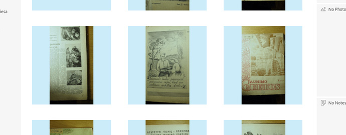
As you can see there can be as twice thumbnails as is now in the row (not three but six) with the same size of thumbnails if there wouldn’t be such huge white spaces. Why not densify thumbnails vertically and horizontally – that would mean less scrolling and user could see more pages at once. That would improved user experience.
Oh, I saw @flachware answer. Yes, that reworking is what I need. I’m waiting for it anxiously, thank you!
About size of thumbnails. I don’t know, what size of thumbnails is in Tropy, latvian ones from the latvian site are about 11-15 KiB – I can’t see small letters, but can see bigger ones as in A4 documents. Loading original photos can degrade performance, I’m afraid (Electron apps are clumsy as it are, my images are on the NAS – it would definitely affect scrolling). Maybe user can select from predefinded sizes of thumbnails, (small, medium and “big” – not too big, of course)? New installation of Tropy could demonstrate all three thumbnails to demonstrate differences.
I missed down/up part :). Yes, it is working. But it would be even better to Ctrl(+Shift)+t and to have cursor in the activated field. Tabbing isn’t very user friendly – if user miss to stop hes is forced to tab all circle over.
And it is visually difficult to distinguish where focus is. Some thin blue or red line around the pane borders would improve situation in that regard.
I would recommend to create dedicate shortcuts (even clumsy ones) for as much actions as possible. Most of users doesn’t use them, but power users like them very much :).
I’m waiting better tag selector. Some my thougts: ability select multiple tags and multiple lists at the same time; ability filter tags and lists by the name and selection that remains after new filtering; and navigation and filtering only with keyboard of course :).
Focus is retained when I am selecting from down (last item) to up (first item), but not contrary. If I select from up to down large number of items focus stays and see how items moves up after merging. It is in grid view, I am selecting with Ctrl + mouse.
@maras to clarify a few things about the layout: the project you are referring to does not use a grid at all in a strict sense, which can be seen here:
There is a different number of items in each row, which facilitates a very compact layout (but note the unused space at the right side). This causes some problems with keyboard navigation in the ‘grid’, e.g. when you use up/down arrows it becomes unpredictable which item will be selected next (as it can be seen in Google Images). Allowing landscape photos to take up more space than portrait photos, which means moving from a uniform to a non-uniform bounding box with all its implications, is a change that should be well-wrought (Adobe Lightroom and Apple Photos stick to a uniform grid).
In short I think we do want to stick to a ‘real grid’ as this grid has to work for all kinds of material, which also includes avoiding the chaotic look of a ‘non-grid’. Your screenshot shows images of one proportion only. Typically research photos have a ratio of 4:3 or 3:2, and portrait and landscape format is mixed.
While the current grid isn’t ideal, the impression of the large white space between the images is partly because of the ratio of the images (about 2:1) and the fact that the images are portrait only. The screenshot below depicts the actual square grid structure.
We should use the space more efficiently, the gaps between the grid cells could be about half the size. However, this will not increase the thumbnails substantially, so do not expect too much from this enhancement.
@flachware Thank you for the clarification. So there is invisible square in grid view to encompass both portrait and landscape (latter would have blue free space from above and belove, not from the sides) thumbnails and the reason for the strict uniform grid is keyboard navigation. I am still unconvinced, so I’ll tell how I’m using Tropy to justify my reasoning.
I don’t think that navigation justifies waste of space. Project view is for “eagle mode” quick browsing, bulk operations for tagging and metadata filling and selecting item to work in item view. Preview is working only in mac environment, so the most work can be done only in item view or jumping from project to item and back. User will use the grid mostly to pic right item from the search results after filling metadata and merging items. Because what can he do more if he can’t distinguish one page from another in the grid view? He will use list view to pic up needed item from the search result. I’m using mostly that view for now – it encompass most items so I need less scroll. And navigation with keyboard is working :). Grid, not list view is useful in merging items. But it isn’t very useful now because I hardly can distinguish where document begins and ends from thumbnails. I must go to the item view, go back, remember what was number of first/last page of the document to select right pages and only after that merge. That is why I am so supporting enlargement of thumbnails. They should be distinguishable. But that can’t be done without enlargement of the white spaces in uniform grid view event more, as I understand (to preserve squares).
And the problem is with landscape – portrait mixtures. I would see solution of that problem in selecting row height by the most tall picture (portrait). Height of the row should be height of the portrait. If there is one portrait picture and height of landscape – if there is only landscapes. Different width of portrait and landscape would create such spaces in right as in latvian project and non strict grid. It’s OK for me as OK is with non ideal keyboard navigation. What are other drawbacks of non-grid grid excluding keyboard navigation?
For browsing and selecting most of the users are using mouse / trakcpad / trackpoint, not keyboard, I think, because most of the time that way will be faster. I like keyboard navigation very much, but when user can’t press ctrl+f to start search in the program he mostly won’t be using only keyboard to select items. Why not use mouse/touchpad to do that if other actions need them?
Keyboard navigation means that 90% and more actions (and 100% of the most used) can be done only by keyboard. And not with tabbing, but with dedicated shortcuts. I can go to the search pressing tab three times, but I must know what pane is active. So shortcuts are more error prone.
Second keyboard navigation layer is Alt+ menu items. They should work for all items and subitems of the menus, now user can open file menu with Alt+f and that’s all – no item of this menu can be selected by Alt (most modern programs can’t manage that, I know, and that’s pity).
@inukshuk Some more things about userfriendliness things.
User opens item in item view and see middle of the photo, the same is when navigating through photos with Alt+ cursor. So after every new page user is forced to scroll to the top of the page (because he usually want to read from beginning of the page, to see title). The only scenario when user wants to see bottom (not middle) of the page is when he is returning from successive page, but not always.
I have several nested list but selecting upper list shows nothing, only selecting list that contains photos show them. But that should work in another way, I think: selecting list with several sublists should show all items from all sublists.
After selecting tags user can’t select list – tags selection disappears, but contrary is working (selecting list and tags after that).
Maybe it could be good idea to show title of the picture under it, not only in metadata pane. This would be useful selecting items to merge and searching item in grid view visually – user can see documents title without activating it.
Maybe ABigImage can be used for previewing (or even in item view): It is very easy to zoom in and out, navigate from one to another picture by just tapping (and with keyboard) and to work with zoomed images (ideal to work with touchpad and touch devices – as in smartphones).
Sorry for long post. English isn’t my native so some formulations can be inaccurate or too rude.
@maras using the Alt+key accelerators for menu navigation on Linux and Windows is certainly something we can easily improve. The main obstacle there is for someone to sit down and find natural keys that do not clash with other key-bindings. To add accelerator keys, all it takes is to add & signs in front of the respective letter in the labels in the menu config file – come to think of it, we should also extract this file from the application bundle, to make it easier to make adjustments to it locally.
With regard to some of the other points you raised:
The photo position should be retained: i.e., if you go back to a photo you were viewing previously it should be at the same position (maybe changed a little if the window has a different size than it had previously). If you’re viewing a photo for the first time, the view will depend on your preferences using either zoom to fit, fill, or using 100% – but always showing the image’s origin/center. We have been considering adding an extra preference to let Tropy know that by default you always want to see the top, instead of the center, which seems like a good option for pictures of written documents. I’ll add your voice as a +1 for that feature.
Yes, currently you see only items in a given list, not all the items of all lists nested underneath the current one (so nested lists work similar to folders in a file system). Here too, we’ve been considering a preference to make it possible to switch and see all nested items instead. We haven’t pursued it because there have been no requests so far.
I thought that there was a good reason for this (something related to keyboard navigation?) – but I can’t remember now. I’ll bring it up with the team, maybe this is just an inconsistency after all.
Just to be clear, you mean showing the ‘title’ field (though, based on the template, items are not guaranteed to have one, so this would have to be configurable), right?
@inukshuk Thank you. Your responsiveness and goodwill are remarkable. Tropy uservoices are heard by devs definetely. It’s a pity that feedback in the forum isn’t very big here. I hope that my opinion can help to make Tropy better.
Yes, configurability is always better. I configured import filenames as titles, so items always have title, but possibility to choose which field should be shown is much better for those with default import options and to users with other usage scenarios.
To my knowledge drawbacks of a non-uniform grid are: keyboard navigation gets unpredictable / harder to implement, keyboard selection of items gets a bit more complicated to implement, and the virtualization of the grid gets a lot more complicated / less performant. There can be tens of thousands of photos in the grid, therefore we have to virtualize the grid for performance reasons (zooming, scrolling, etc.), which means we only render certain items into the grid, the ones that are close to the viewport. With a non-uniform grid it gets complicated to calculate the correct grid size. Last but not least, a non-uniform grid is less structured / looks more messy than a uniform grid.
Although I can’t make any promises at this point, we’ll consider your suggestion and I’ll add your vote to the non-uniform camp.
If I’m not mistaken you would appreciate the custom preview window feature (hitting space would show a large preview in the project view). In the meanwhile, there is a shortcut that might be useful to you: when you are in the item view, you can press Alt + up/down arrow keys to navigate items. This way you have a large ‘preview’ while editing metadata.